Exploring possibilities & interaction between devices.
Food delivery service is pretty popular recently. It seems that almost anything (or at least some business owner attempts to) could be delivered at your front door nowadays immediately. I try to break out the basic flow of the App that I made of (it's called 'Fresh Express') to demonstrate how to order food via App, which includes signing up, browsing, ordering, and checking out.
I do order food online sometimes awhile ago, but haven’t ordered grocery box before. So I do some study and see who provides this kind of service and how it works before diving into pixels (Almost every service provider’s website has a section called How it works. Interesting).
While getting more and more hungry by going through hundreds of recipes and dishes online and Apps, here is what I found:
1) Almost no one would deny this is a good idea, and almost everyone think it is indeed be able to positively connect between providers and customers. In other words, the market exists.
2) Delivery time and overall cost of running the business are the major issues. People would be attracted by the efficiency of how fast they can get the package. Because it still needs time to process and prepare materials.
However, there are some ‘traps’ in there, which could be huge:
1) The uncertainty cost would be a headache for amounts of orders coming in. Business owners might be out of mind between balancing price per box and the budget that comes from nowhere.
2) Complex logistics and the saturation of market share have become severe competition and posed obstacles for some.
But we’ve already ordered pizza online for years, right?
Alright, I know it’s still different. Let’s pause here a little bit and see some online ordering services.
I look into eight platforms that provide food delivery services from local favorites and select couple of parameters to compare side by side, such as mobile/web App, features, box size, price, delivery type, checkout, Facebook fan page, and reviews. Some applications I cannot reach out due to the validation of App Store over my account region. I finally choose four apps and try their ordering and registration process experiences by myself. By the way, this can only judge from a very small fraction of all jouenry where many follow-up procedures haven’t yet to be tested in person. The four apps that I choose are Chef’d, HelloFresh, Munchery and Postmates.
If we check their ratings in App Store, Munchery has the highest score (4.5 stars over 1,647 ratings) among the four. Different mobile platforms might vary, but here only iOS version is taken into account. Let’s walk through each steps of what those players provide and serve.
1). Registration
They all prompt users to sign up or log in first, although it’s not strongly required in a way, which might not be good experience design if user must sign up to proceed. Though operators would like to provide personalized contents and recommendations for users to gain conversion rate. Apparently Facebook makes this tedious work a lot much easier than before.
2). Select Meal
Here we comes the tasty part of all. Pictures of delicious food are what we are waiting for. But we see two of them showing an alternative path for user to ensure the service is reachable. Munchery and Postmates give user the input of location to start the food track first, to filter out whether the package could be guaranteedly delivered. From design point of view, it could affect how we could shorten the process of filling up the address later while marketing strategy would be also involved as well.
3). Place Order
Once user selects what they want to order, they can tap Checkout and will be brought to delivery and payment pages. Basically there are two main steps. Firstly you need to confirm what you order; secondly you need to type in how you will pay and where you can be reached (delivery address). Again, address and payment information are unavoidable, but once it’s done, ordering online will become much smoother.
Those are the basic procedures we could summarize so far. Pretty easy, right? But actually, they say that the devil is in the detail. Let’s go dig in.
There are pros and cons for each App interface design mentioned above, while one of them might seem to be more efficient than the others. However the need for specific information from user's perspective might differ from one another. Let me break it down step by step.
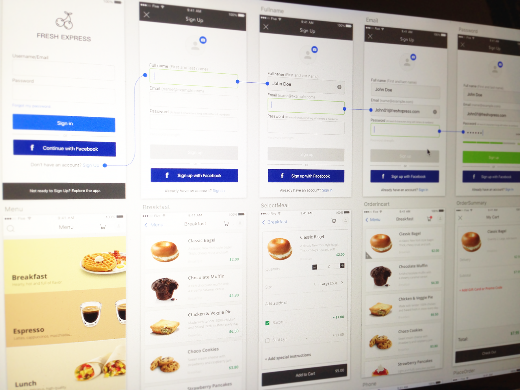
Introducing ‘Fresh Express’
The first thing that came to my mind is: How to contextually lay out the idea of food sharing for the better? From the higher level to the pixel layers of interface, I sketch it down in diagrams and explore the elements to converge and the questions to ask.
Below I'll walk through the three basic steps of food ordering and UX design illustrated earlier, and from this crafting process of iteration, I'll also point out the tricky part of it and how we could apply the best design practices to address the need.
1) Registration (without using Facebook account)
Registration includes three fields: name, E-mail, and password. Sometimes name is even not necessarily needed. So basically there will be three input fields and one action button. It will be great if we could use any smart default to speed up the process. So we assume our regulars come back to our App, so she can directly sign in by Email or via Facebook account. At the sign up page, as mentioned above, three fields are needed. Full name will make more senses in a way than typing First name and Last name, which is somehow against what we conventionally interact in the real world. The flow is shown below.
The password strength will show the hint beneath when user types in the combination of characters. If it is good or better, the sign up button will be clickable to move on.
2) Select Meal
This step has taken more nuances than expected because there are so many micro-interactions might occur. How user would view her selection? What if she changes her mind? How to sum up the total price? How to inform user the most valuable but not necessarily the primary information? And how to define the hierarchy? We always could make it more complex, while also make it much simpler. The scenarios that I lay out include quantity selection, size, side dishes menu, and special instruction. Keep in mind that color and text will offer significant hint while user glancing through the screen and from page to page.
3) Place Order
Finally we are at the tediosu and the most time-consuming part of the flow, which is extremely related to the engagement and conversion rate dramatically. Two primary pieces of information are required: payment information and delivery address. If poorly designed, the form would be so long that user would never want to complete. But this is not the worst case. The worst case is that the information provided by user might be filled incorrectly because the instruction is confusing. I tactically concise a whole lot of fields into merely six, where two of those are filled by smart default initially.
As you can see the magic secretly resides in the alternative way of filling the credit card number. The twelve digits plus another seven digits are brilliantly following one after another, so user can type in a single place, while the zip code comes at the end.
The data that the business owner needs actually might not necessarily be coded in silos. The chances are that user would be intimidated by a long form and never comes back again. So think about what is the most important data that we want to keep and we definitely can take good advantage of each time we talk with users if we really need from them.
Check the video of the overall flow prototype below (some tiny part might be tweaked little bit).
The food delivery concretely could embed more situations that are based on users' needs and behaviors. The purpose of this design is trying to focus more on the details of how the majority of people could smoothly jump from one page to another without too much friction ahead, which definitely could be continuing to learn, iterate and improve upon it while more constraints introduced.