UIUX Design & Research
AI
Blog
About
Menu
David Chen's portfolio
When left and right brains mix.
UIUX Design & Research
AI
Blog
About
prev
/
next
Back to UIUX Design & Research
1
A bag of friends: Social Ecommerce for LINE Shopping
2
LINE SHOPPING
1
LINE TODAY
1
Hello moto: Project Discovery
1
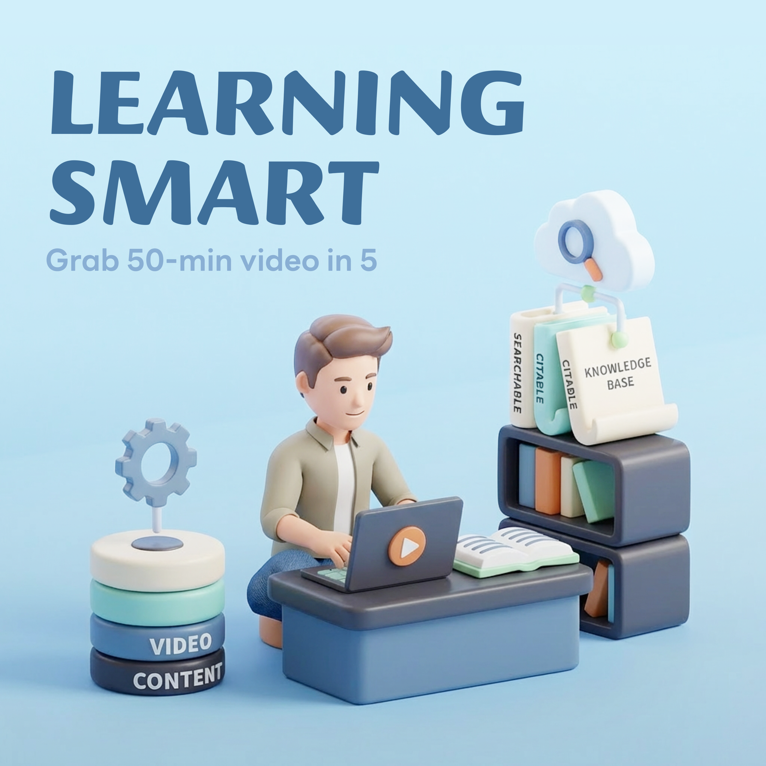
AI-Powered Video Learning Platform
1
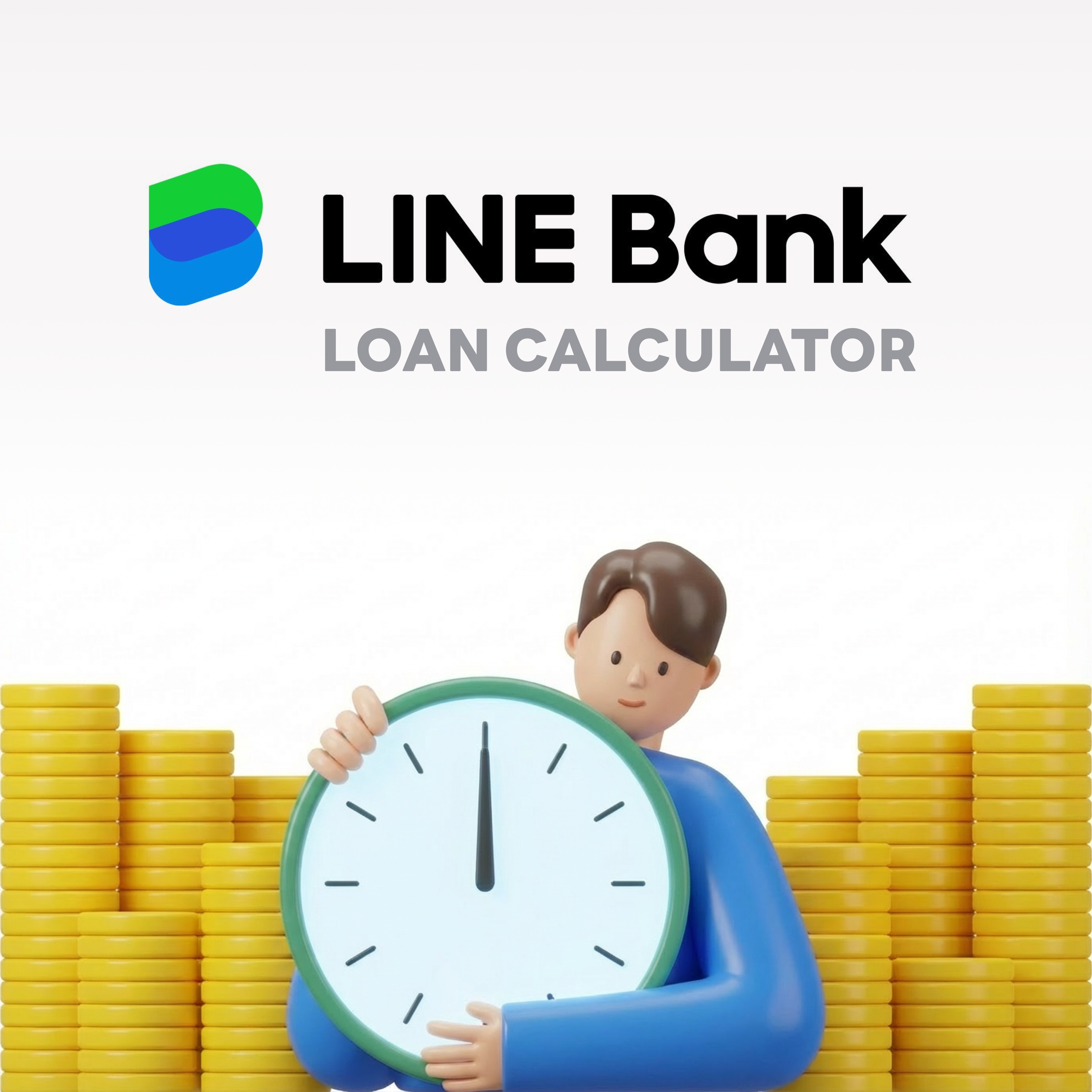
🔒 LINE Bank: Loan Calculator